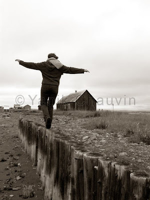
Marquee

Chris' School Blog!

Clock

relojes web html clock

Friday, January 14, 2011

T-Shirt Project

Hat Project

(Tyte Lids project part 2 of 2)

Hat Project

(Tyte Lids project part 1 of 2)

Art in Action Poster

For this poster project, I took the orange background picture off of Google images and changed several things with it. I changed the contrast and I also duplicated the layer and free transformed the one of top of it to make it look like more of a swirl. I also added a slight faded boarder to the edge by lowering the opacity and shade. With the background done, I moved on to editing the text “Art in Action”. I used Hue and Saturation to edit the texts color to change it from the neon orange color it had to a red color. One that was finished I also added a red glow to the boarder of the letters to make it pop out a bit more. Then, I duplicated the text layer and put it on a whole new layer turned upside down, darkening it and lining it up with the original one making it look like a shadow. I went into the “Filter” dropdown menu and added several blurs and effects. The second last effect I added in at the top of the poster was a lens flare to make it look professional. With that I cropped out the last unwanted things that I didn’t want on the outline and finished.
(Also props to Nick Chubb for helping me out alot on this)

Monday, November 8, 2010

Picture Commentary

                                                           (1)

                                                            (2)

                                                                (3)
                                         (4)


Picture Number 1

The photographer placed the main subject in the top left of the picture, using the Rule of Thirds. Also, the logs that he is walking on lead straight to him, this means that the photographer used Leading Lines as well.
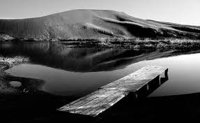
Picture Number 2
In this picture the Photographer didn't use any rules in particular. But he did darken the picture and make it black and white, adding a nice feel to it.
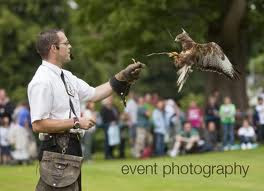
Picture Number 3

The photographer put two of the main subjects of the picture in the top right and bottom left of the picture, using the Rule of Thirds. He also showed a relation between the two subjects. Then to emphasise the relation, the photographer blurred out the background of the picture.
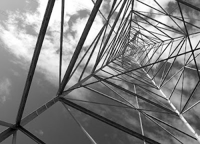
Picture Number 4

In this photo, the photographer used, yet again, Rule of Thirds to attract the eye of a person to the top right. He also used black and white to add a nice feeling to it.

Thursday, October 21, 2010

Yearbook Proposal

I Christopher Varga Raic will be creating a page for the yearbook with the title “ New Start”. This page will include seven images which will reflect the difficulties of a new student coming into an unfamiliar school and dealing with the frustrations of the first few days. I will set up these photos and direct my friends during am lunch and after school to illustrate such events as finding my locker, getting bumped around in the hallways, finding my bus, too many books, making new friends, lunch problems etc. I will use my friends Chris Waet,Liam Johnson,Nick Chubb and Savanna Dunkin will photograph these situations with them and with their consent. I plan to have these images by next class.